A term you most definitely have come across is "responsive website" or "responsive web design". But what does this mean? What makes a website responsive? And why is it important?
What is a responsive website?
Let's start at the very beginning. What is a responsive website? Quite simply, a responsive website is one which changes how design elements are structured depending on what size screen you're looking at.
This means that when you compare a website or web page on a desktop computer and a mobile device, whilst the design may look similar, the way they are laid out is different.
Still confused?
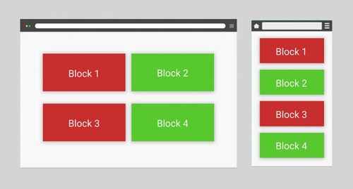
The diagram below is a mock-up of a web page. The left hand side is what you might see on a desktop computer. On the right hand side is what you might see on mobile devices such as on mobile phones.

Notice how desktop users will see the green block next to the red block. Meanwhile, on mobile devices they will see the green block underneath the red block.
This is because the blocks will change their position depending on screen size that web pages are viewed on.
In other words, the layout of website design elements responds to the screen size. It is a responsive web design.
Why are responsive website designs important?
Responsive web design is a result of the rise in mobile devices. Before responsive web design existed, businesses would often have to create two versions of their website. One for desktop users and one for mobile users.
Two websites create twice as many problems as one website. Businesses would end up having to pay for the design and development of two websites instead of one. They would have to update content on two websites instead of one. And they would have to maintain and keep two websites secure.
Responsive web design changed that. Now businesses could have one website built which would automatically adjust for smaller screens.
Not only did this reduce cost, but it also reduce investment and potential problems.
Advancements in mobile technology also saw more people browse the internet on their phones. Not having a mobile-friendly website meant that people visiting your website saw the desktop version instead.
And viewing a desktop version of web pages on a mobile device only leads to trouble.
Users have to scroll sideways to see the page in full. The text would either appear too small or too big. The experience would be awful.
And that has serious impact on how your business is perceived by potential customers and clients.
What are the dangers of not having a responsive website design?
Not having a responsive web design can have more than just a negative perception on your business.
It can also impact your how your website performs on search engines like Google.
In simple terms: How do search engines work?
Search engines work using a piece of mathematical code called an algorithm. This algorithm scores your website and the content of your website on over 200 different metrics.
After someone asks a search engine a question or query, they will be met with a series of links to other websites. The ranking of these links is based on your websites score against the algorithm. The higher score you have, the higher you will rank. The higher you rank, the more clicks you get.
In 2018, Google launched a change to their algorithm. This change was called 'mobile-first indexing'.
Explaining the complexities of mobile-first indexing could be as long as War and Peace. So, put simply, it means that Google began judging websites on how mobile-friendly their designs were.
If your website wasn't mobile friendly, it would get ranked down.
A website is considered not mobile friendly if:
- Content goes beyond the viewport width (i.e., users had to scroll sideways to see content)
- Buttons are too small for people to easily click on them
- Text is too small that people wouldn't be able to read it.
Ensuring your website design didn't fall foul of these errors became vital. A drop in rankings could see a drop in orders, enquiries and leads.
A responsive web design ensures that your website is mobile-friendly on any sized screen. Whether that be a large screen - such as a cinema screen - right down to the screen size of the phone in your pocket.
How to check if your website is responsive
There are two things you need to look at when checking if your website is responsive.
- Does it look and act responsive
- Is it responsive from a technical point of view
Does it look responsive:
The first one is surprisingly easy to check.
Open your favourite browser and visit your website. Then you want to ensure that your browser window isn't in full screen mode.
You can check for this by looking in the top right-hand corner of the window. You want to make sure that you see a square next to the x rather than two squares.
Then, you want to grab the size of the window with your mouse cursor. Slowly change the size of the browser.
If you have a responsive web design, the structure and layout of the web page should change automatically. This should be instantaneous and you should see it change as you're resizing the screen.
Additionally, you can also check whether your website is responsive by opening it up on a mobile. It should look and feel like the desktop version of your website. But you should notice that the structure and design elements are laid out differently.
Is it responsive technically:
First off, what do we mean by "responsive technically"?
There's two parts of a website. The side that people see. And the side that is hidden in code.
Sometimes these two parts don't match it. A website might look like it's right and correct. But the code might have been written in a way that actually the website is littered in errors. Errors which go unseen because they are hidden in the code, where people don't usually look.
The problem is, Google doesn't have eyes. Whilst a website might look correct, Google can only read the code. And if the code has errors in it, Google will notice.
Therefore, "responsive technically" means does the website have any errors in the which impacts its mobile-friendly score?
Fortunately, this tends to only crop up in two areas:
- button sizes, and,
- font size.
Now, you may be thinking "technical... I suppose that means I'll need a developer or something to check it". But you'll be wrong.
Google provides a way - in fact a warning system - for mobile responsive issues.
Which leads us perfectly to...
How to find out if Google spots mobile issues with your website
You've most likely heard of Google Analytics. It's a fantastic free tool. With a couple of lines of code you can explore your visitors to your website.
You can see where they've come from. What pages they've looked at. How long they've spent on your website.
It's absolutely incredible!
But there's another free tool from Google that is less well known: Search Console.
Search Console is an equally fascinating tool. And the data it provides can be invaluable.
Google Analytics is a tool that shows you how users act on your website, whereas Google Search Console is a tool that shows you how Google sees your website.
Search Console shows you what search terms people are using to find your website. How many people are clicking to visit your website. And what position on search listings your website is appearing for.
Another feature of Search Console is that it will warn you - by email - of any mobile responsive design errors in your website.
It'll also tell you exactly what is wrong; where the error is; and even give some guidance on how to resolve it.
Search Console currently reports of four possible errors.
- Text too small to read - Text size on websites should be a minimum of 12 pixels. Any smaller and visitors to your website may struggle to read it.
- Clickable elements too close together - In other words, buttons are too small. Or, two (or more) buttons which are sat next to each other, are too close. Ideally buttons should be between 44 and 48 pixels. This is because 44-48 pixels is about 10mm tall and wide. And 10mm is the average size of a fingertip. Any smaller, and there's the risk that people won't be able to click on the buttons easily.
- Content wider than screen - Simply put, this means that the content of your website is wider than the screen width. This means that website visitors will need to scroll sideways to read your text.
- Mobile-friendly pages - This error is quite vague. Essentially it states whether your web pages have the correct code in them to be responsive.
Setting up Google Search Console
It is a relatively straightforward process for setting up Search Console. However, there is a validation process that might require help from your website developer.
All you'll need to begin the set up process is a Google verified email address.
If you do not already have one, you can set one up by visiting the account set-up page. We would recommend using your existing work email address when setting it up. This can be achieved by selecting the option 'Use my current email address instead' during the account creation process.
Once you have a Google verified email address, head over to the Search Console log in page and hit the giant "Start Now" button.
If you're not already logged in, you'll be asked to sign in.
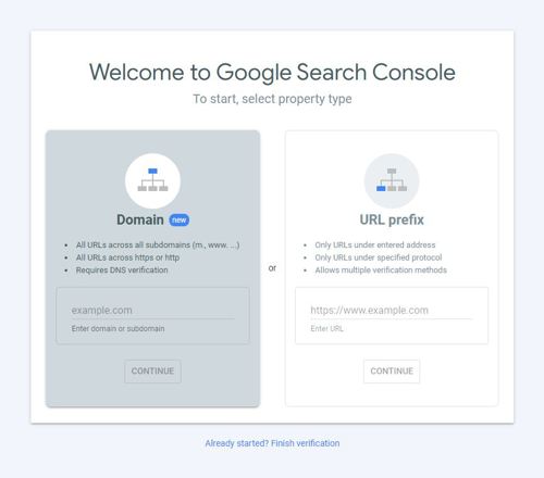
You'll be met with the following set-up screen:

You have the choice to set up your account as either through the Domain (i.e. the server) or through the URL (i.e. the web address).
Either option will provide you with the same information, but the Domain option may require assistance from your website developers or someone with server access.
Once you've set it up, you will need to leave it for a while to collect the data. This takes between two to three days.
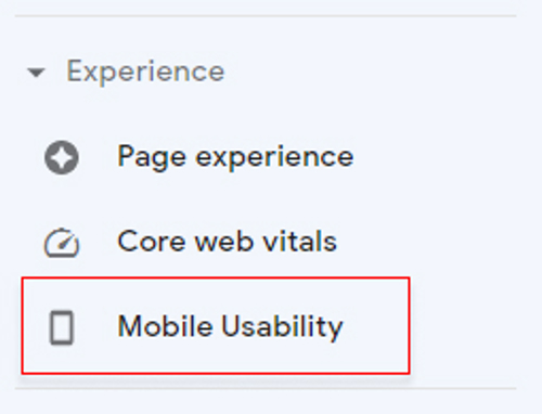
After the data has been collected you will see a tab on the left-hand side called "Mobile Usability":

Select this and you will see if your website has any mobile responsive design issues.
How to fix a website that is not mobile responsive
Once you've identified that your website has errors, you'll want to get them fix.
But how do you do this?
Unfortunately, most issues with responsive design is due to coding errors. This means you will have to reach out to your website developers to have the issue resolved.
However, you should be able to identify and track responsive design issues through Google Search Console. This will give you oversight on how well your site is performing.


